TRANSPORTATION RESEARCH AND EDUCATION FOR DRIVING SAFETY
Digital Communications
The Transportation Research and Education for Driving Safety (TREDS) Center serves as a leader in promoting safety for all transportation users by developing and implementing education programs, and conducting research to inform and enhance public policy. I led the design and implementation of digital content and media strategies to promote TREDS programs and events to key target markets.
Promotional Videos
ART DIRECTION, ANIMATION, ILLUSTRATION, SOUND DESIGN
As part of our strategic communications strategy to promote and highlight TREDS education programs on driving safety, I created several compelling promotional trailers and testimonial videos with diverse voices and perspectives that resonated with the target audience.
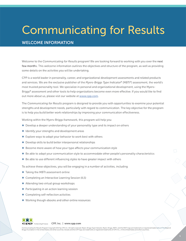
THE MYERS-BRIGGS COMPANY
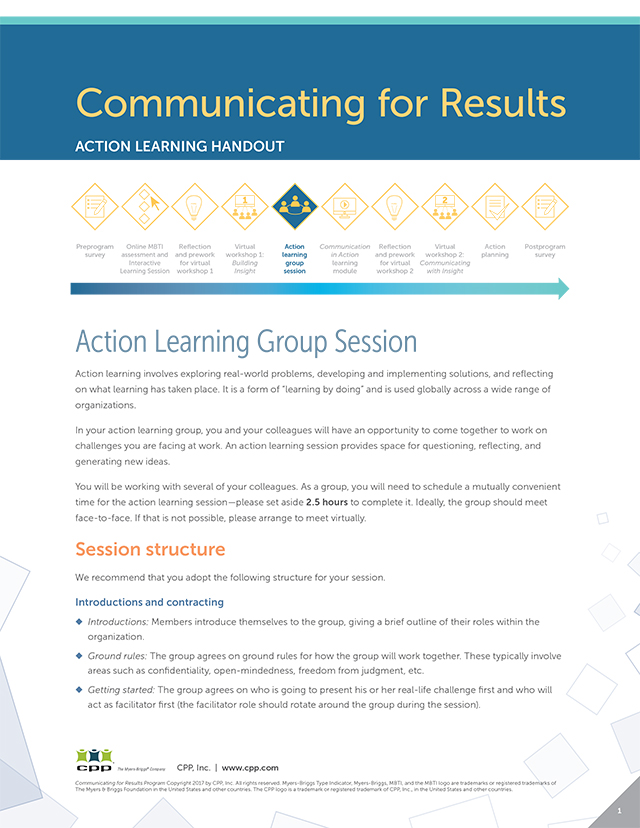
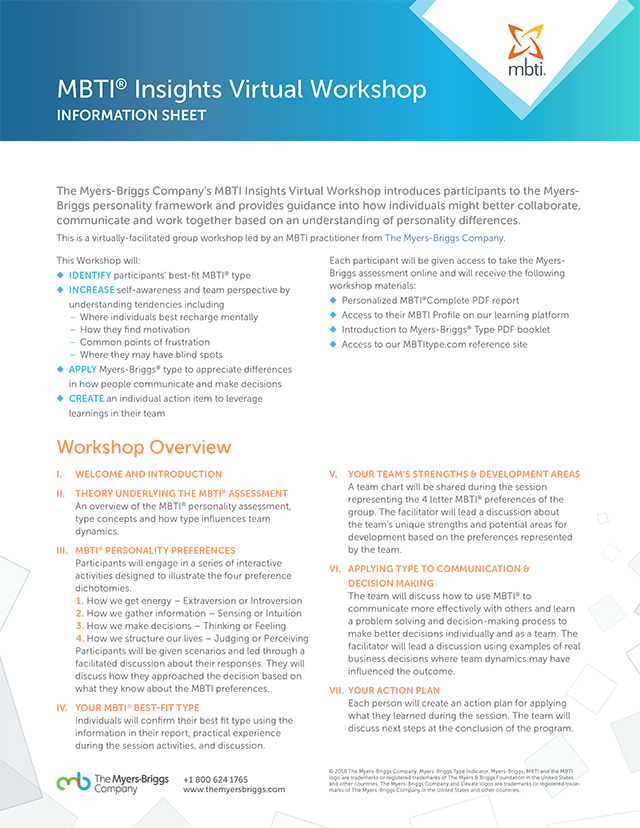
New Product Development
The Myers-Briggs Company provides people development solutions and empowers people and organizations around the world to improve teamwork and collaboration. To better serve their clients, they developed a new eLearning product, Solutions, for online training with original coursework as well as leveraging existing product content and materials. It was a complex project with multiple components including workbooks, program guides, manuals, feedback cards, presentations, videos, handouts, email marketing promotions, and digital reports generated from online assessments. The challenge was to create a distinctive branded product line through design, and to provide a consistent brand experience by aligning the design and content elements throughout the materials.
eLearning Module
ART DIRECTION, COURSE DESIGN, ANIMATION, ILLUSTRATION
An important component of the Solutions program, the Communicating for Results elearning modules provide program participants the opportunity to learn and test their knowledge during the online training sessions. I created the modules in Storyline 360 using the instructor-led PowerPoint course content and adapted them to the eLearning format with animation and interaction to facilitate effective learning.
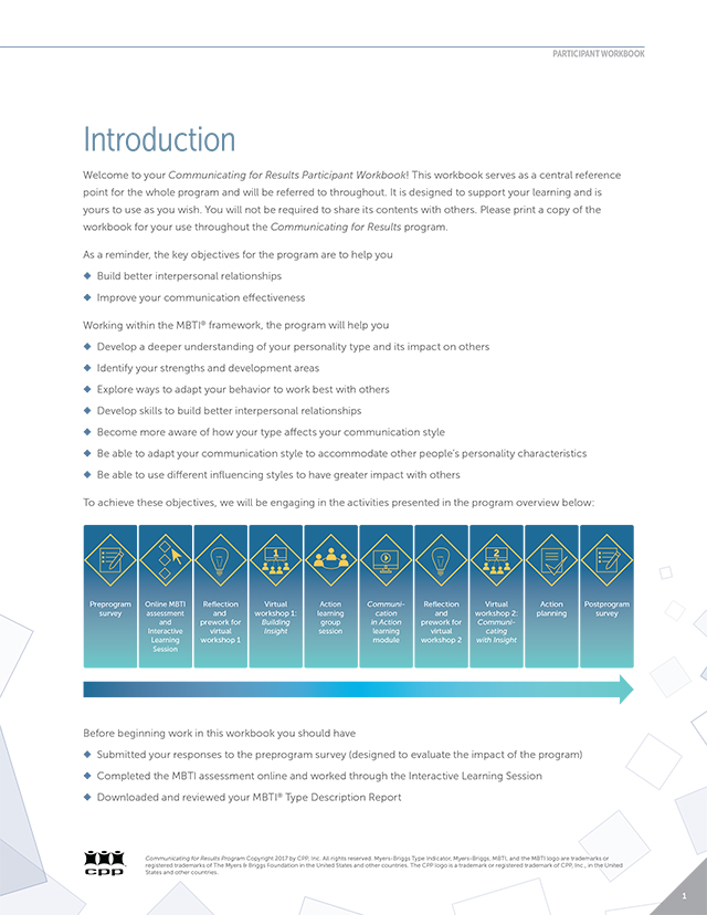
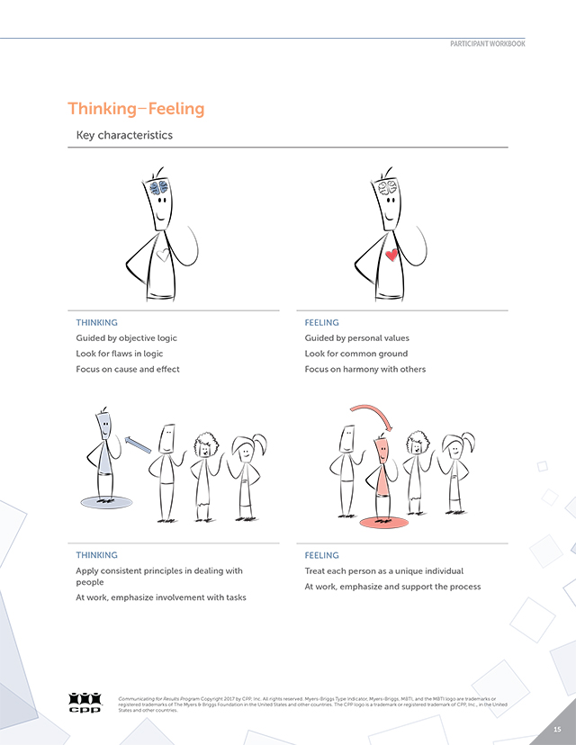
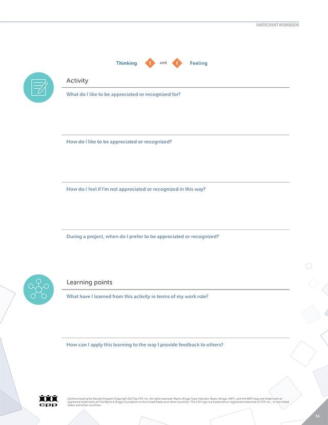
Participant Workbook
ART DIRECTION, DESIGN, BRANDING, LAYOUT, ILLUSTRATION
The Participant Workbook was the main document that the customers would use to follow along during the online training program. Hence, it was beneficial to develop the look and feel of this piece first, and then carry out the design across the supporting materials. Working with Marketing and Product, I developed several concept ideas but narrowed it down to the design below for its clean and contemporary feel, and a sense of dynamic motion with the diamond swirls. I also created the icons and illustrations and used them as branding elements in other pieces for the program.
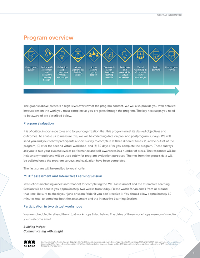
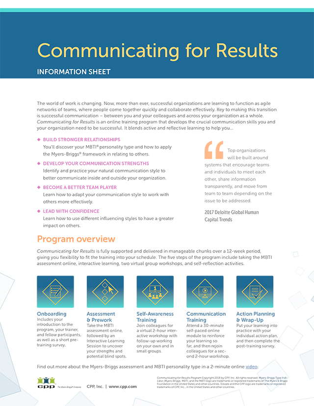
Program Material
ART DIRECTION, DESIGN, BRANDING, LAYOUT, PRODUCTION
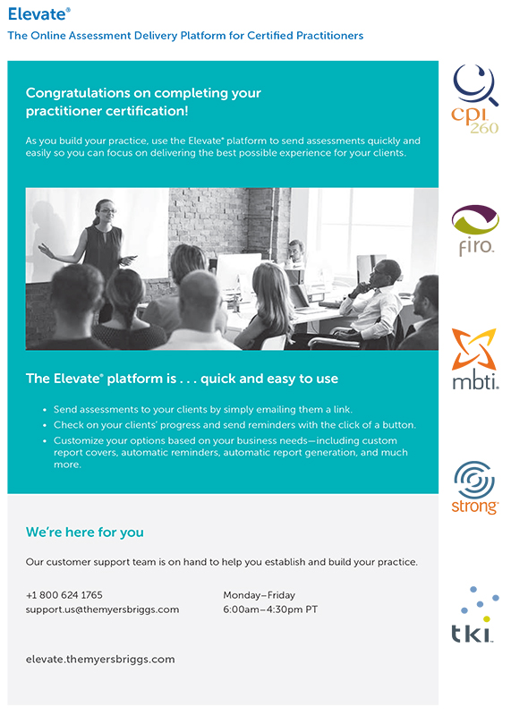
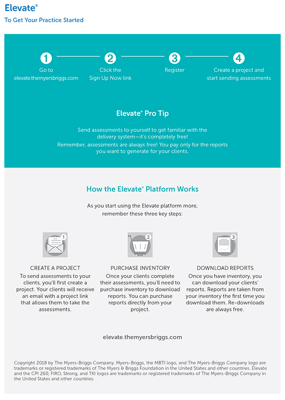
The Communicating for Results online training program had multiple touchpoints with our clients. To provide the same brand experience, it was essential to ensure the branding and messaging was consistent across all channels and marketing collateral. Email notifications, online surveys and reports, information sheets, instructional videos, presentations, and online assessment portals have the same color palette, visual imagery, tone of voice, and language to ensure consistent brand experience.
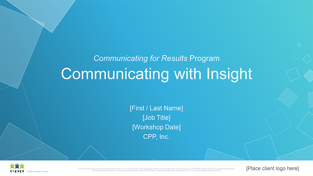
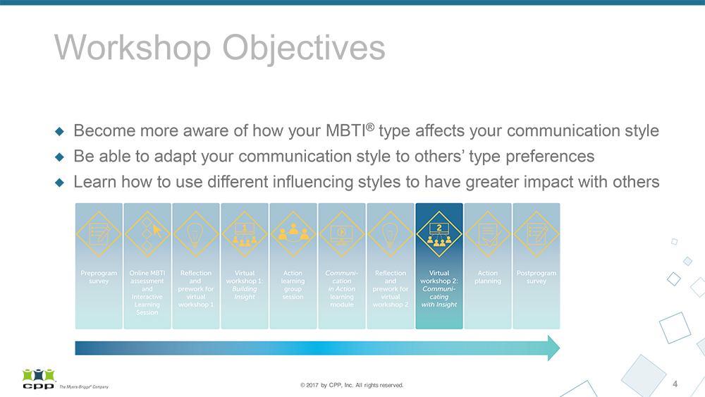
Program Presentations
ART DIRECTION, DESIGN, BRANDING
The presentations were a major component of the online training program. I partnered with Product and Content to craft a narrative through the slide deck, leveraging existing content and impactful imagery to tell an engaging story.
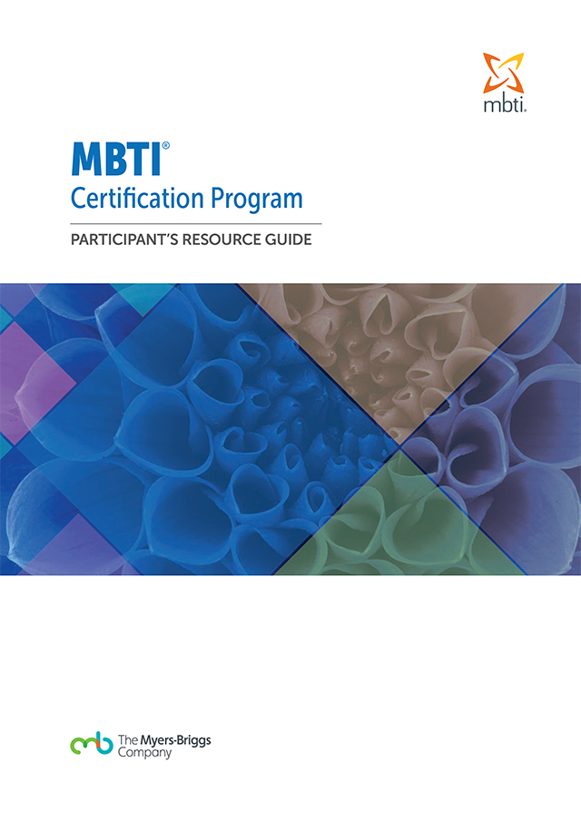
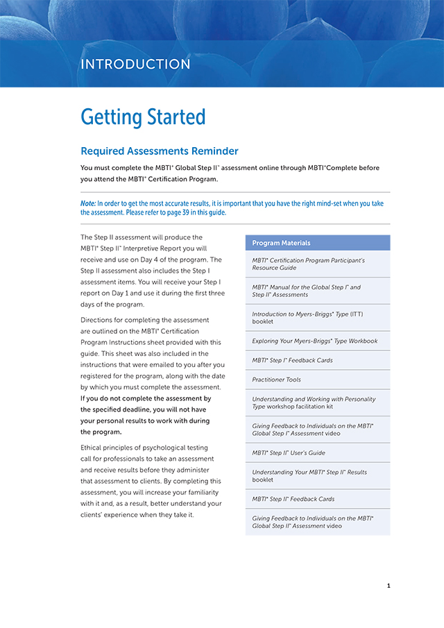
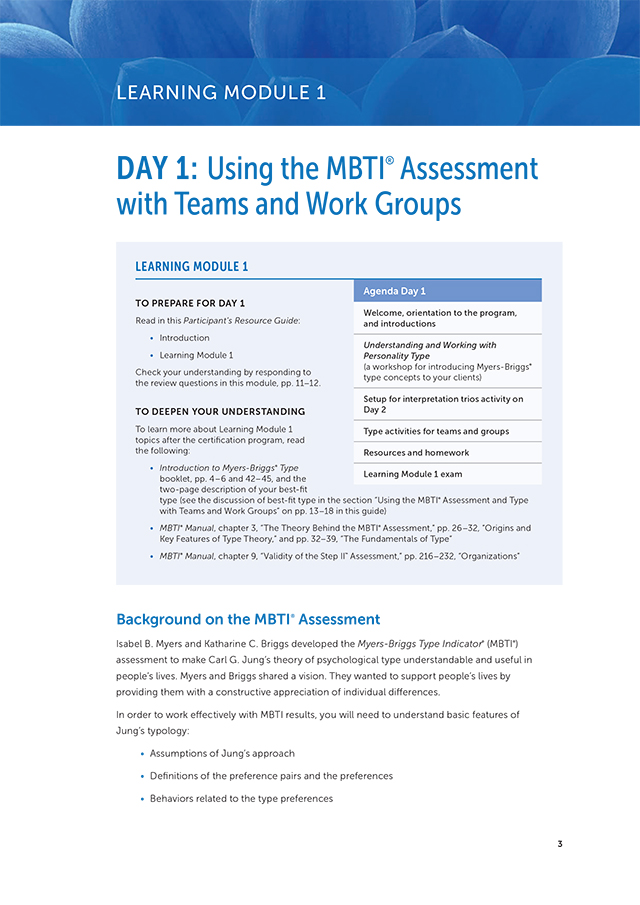
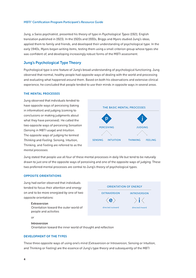
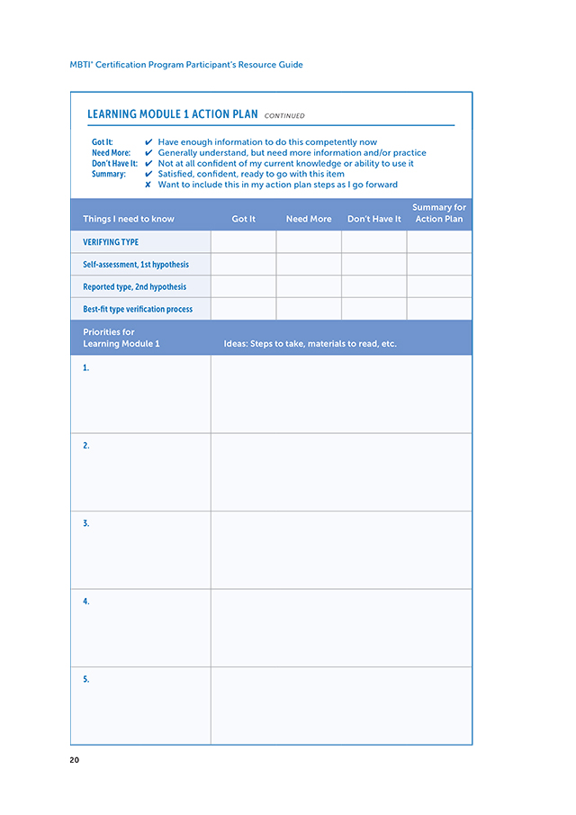
Participant Resource Guide
ART DIRECTION, DESIGN, BRANDING, PRODUCTION
As part of the effort to improve the MBTI brand experience, we updated the certification program and its supporting materials. I developed new designs, changing the look and feel through color, font, imagery, and more contemporary illustrations. This 160-page guide was designed and laid out in Adobe InDesign with a linked Table of Content dynamically updated as pages were added or moved around.
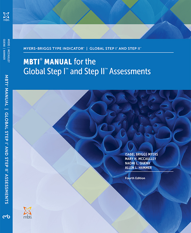
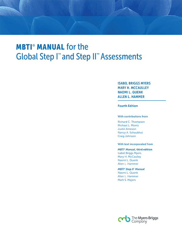
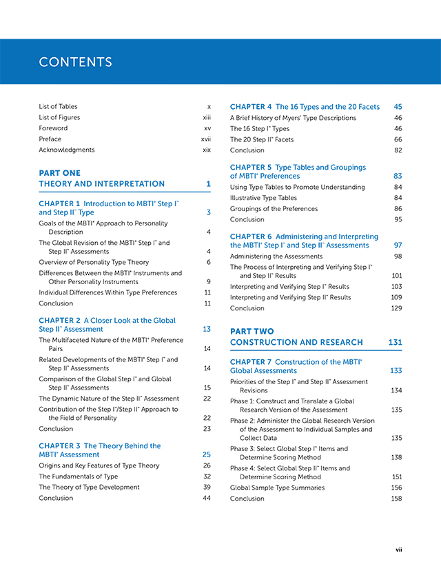
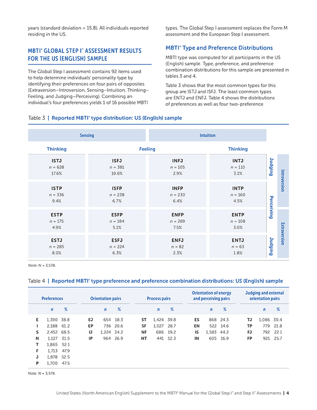
MBTI Manual and Supplements
ART DIRECTION, DESIGN, BRANDING, PRINT PRODUCTION
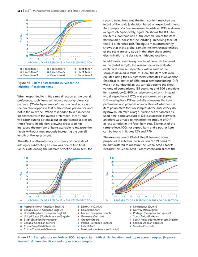
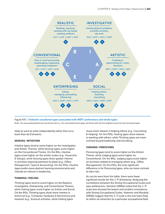
The MBTI Manual was also updated and rebranded with new color, imagery, content and graphs. This project presented many technical and content challenges and took nine months to complete. There were multiple authors responsible for different chapters and it was important to ensure the language and tone was consistent throughout the Manual. It was also challenging to ensure the graphical and design elements and styles were consistent throughout the 400-plus page Manual as well as 23 accompanying Manual Supplements for different countries. The Manual was printed and the downloadable PDF version had linked Table of Content and Index.
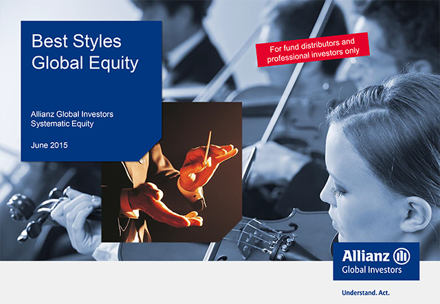
ALLIANZ GLOBAL INVESTORS
Global Rebranding
Allianz Global Investors is a global asset management firm. To strengthen their brand identity and philosophy, the firm launched a global rebranding initiative and incorporated the tagline “Understand. Act.” to their logo. The concerted brand rollout included a series of videos, marketing campaigns, and updated marketing collateral for both internal and external communications.
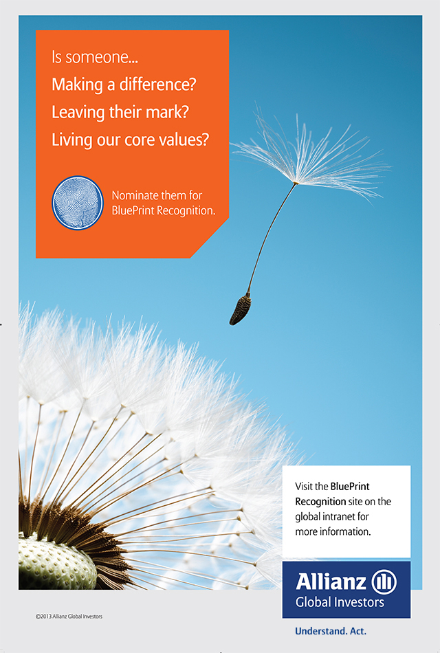
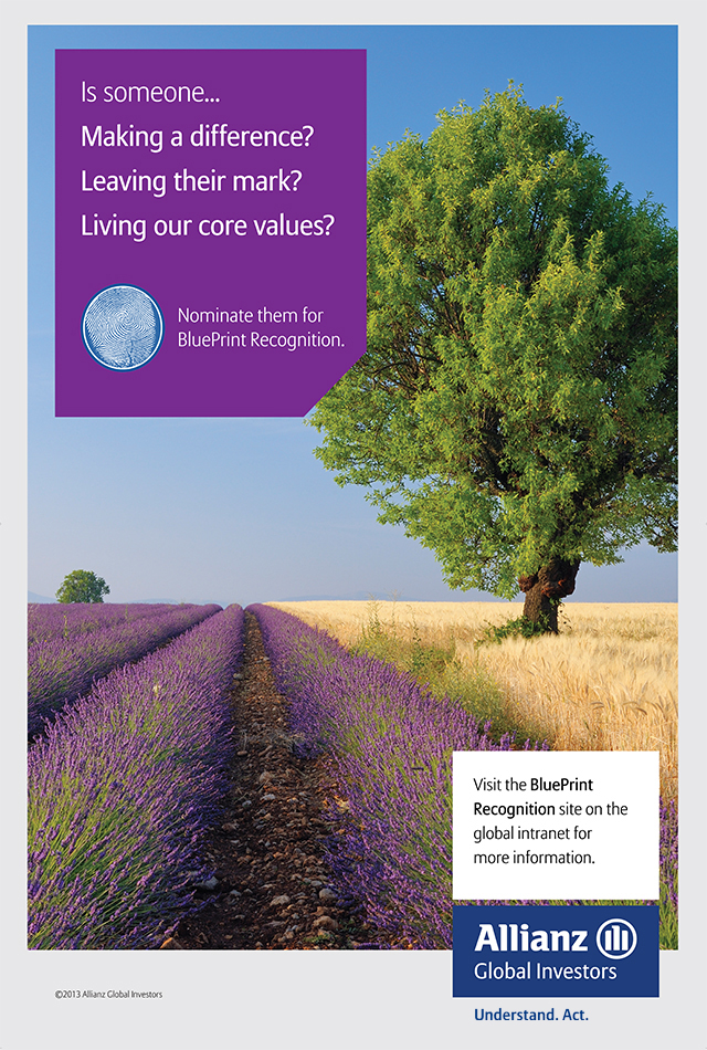
BluePrint Recognition Posters
DESIGN, BRANDING, PRINT PRODUCTION
As part of the global rebranding initiative, I collaborated with the Chief Marketing Officer and launched the BluePrint Recognition program to acknowledge employees for their contribution to the organization. I designed a series of posters and certificates, and created an online nomination form for employees to nominate their peers. I received the first BluePrint Recognition Award for Employee Excellence.
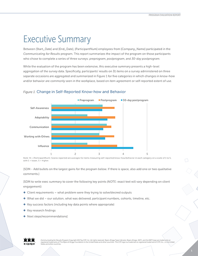
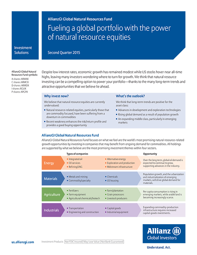
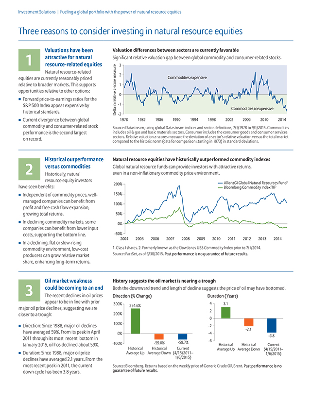
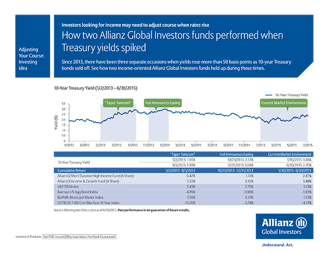
Marketing Collateral
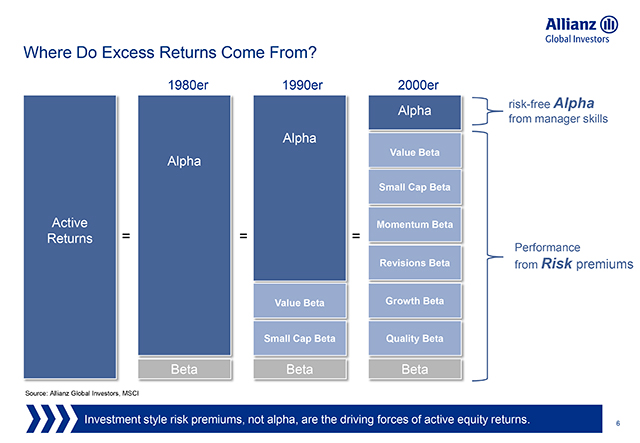
DESIGN, BRANDING, CHART AND DATA CREATION, PRODUCTION
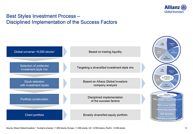
As part of the global rebranding rollout, all the marketing materials were updated. Below are samples of brochures, information sheets, and product profiles. These pieces were designed in Adobe InDesign with charts created in Excel or Adobe Illustrator based on performance data generated from proprietary software.
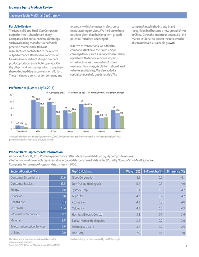
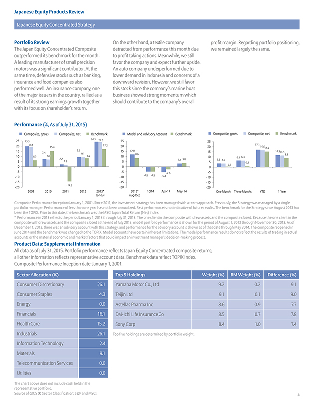
Sales Presentations
DESIGN, BRANDING, CHART AND DATA CREATION, PRODUCTION
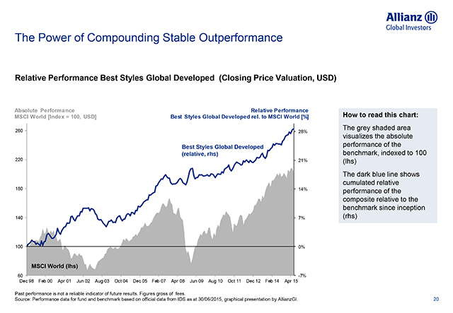
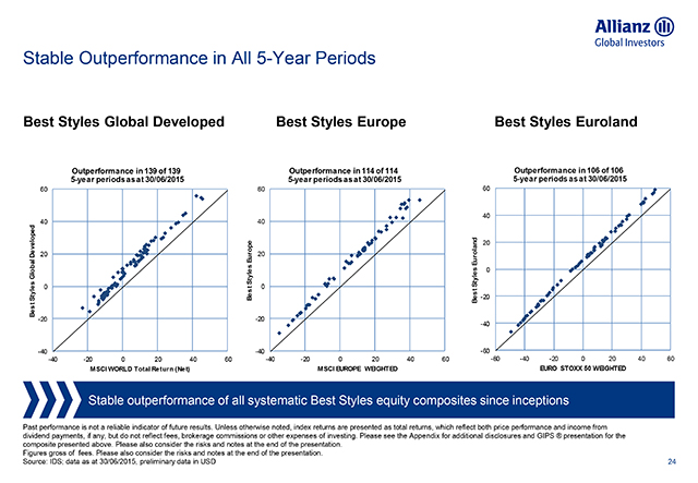
Product presentations were essential for Portfolio Managers, Sales and Consultants to pitch the products to their clients. I updated the presentations quarterly with the most current performance data, and generated different charts for comparison with respective benchmarks. I often worked with Portfolio Managers to update the narrative in their presentations to highlight the current market condition and forecast future growth.
GOLDEN GATE GLOBAL
Global Marketing Communications
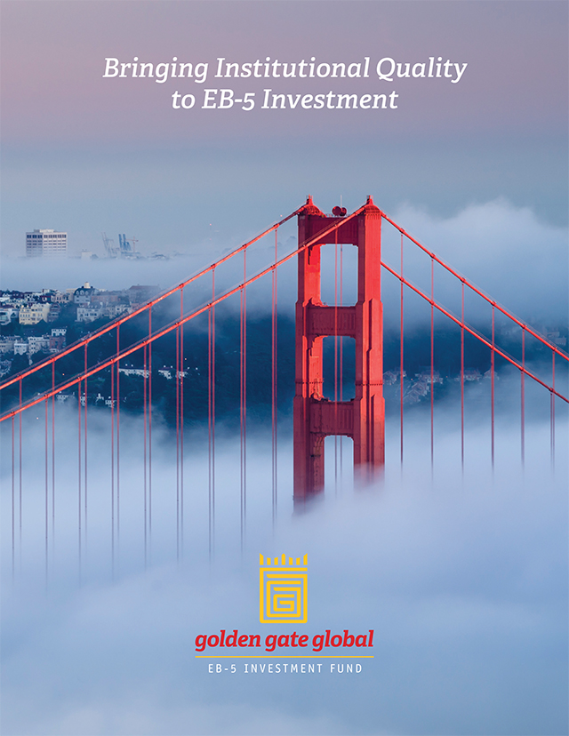
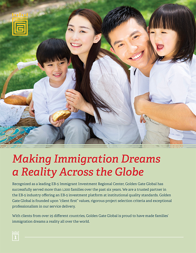
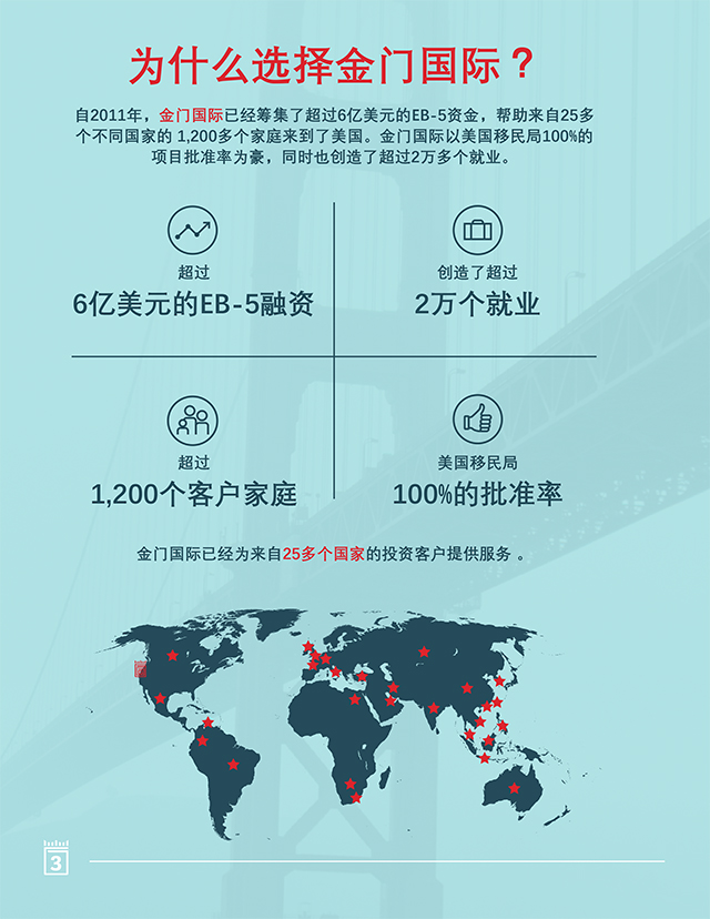
Golden Gate Global offers clients from 25+ countries real estate project investment opportunities in the San Francisco Bay Area. To help them market their EB-5 fund to local and international clients in Asia, I designed a set of marketing collateral in multiple languages to reach targeted markets.
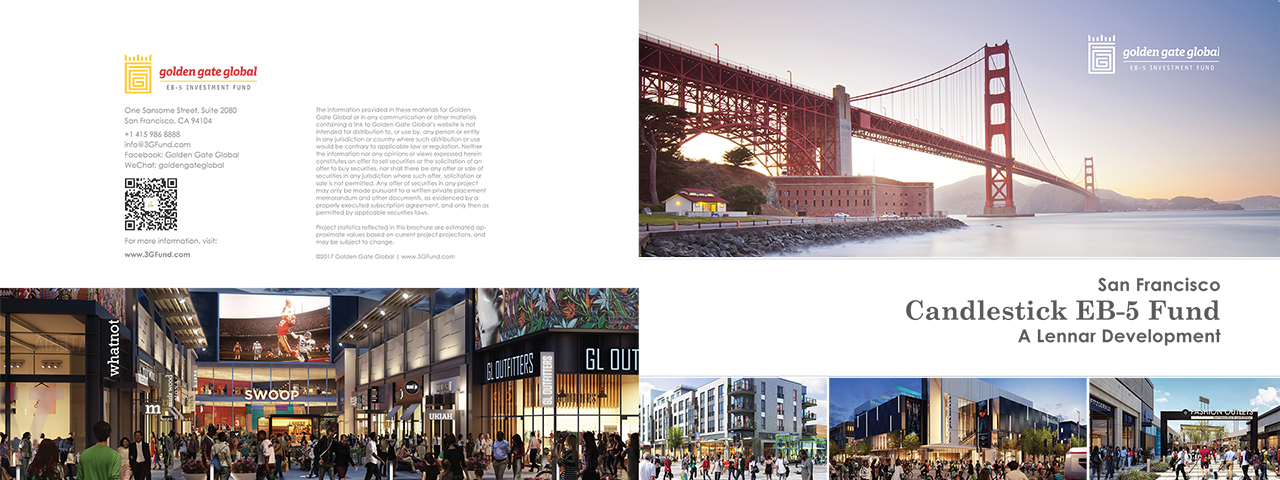
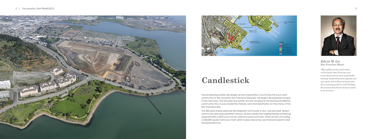
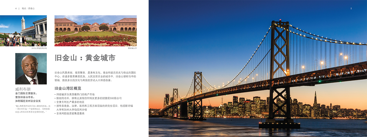
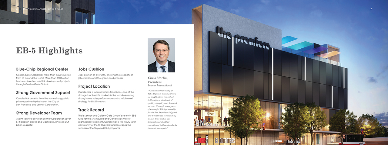
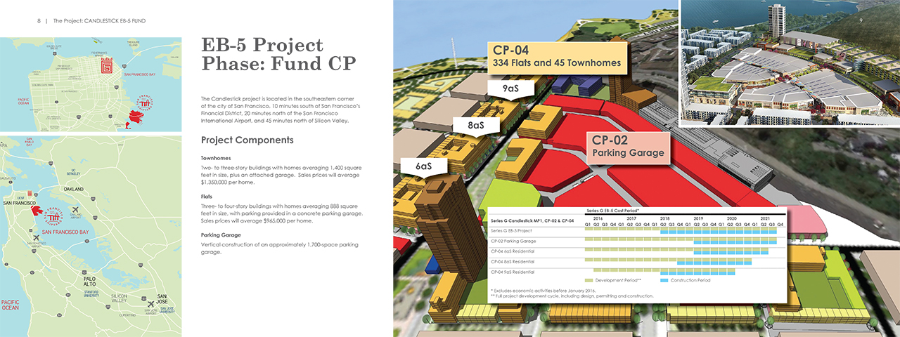
Candlestick EB-5 Fund Brochure
ART DIRECTION, CONCEPT DESIGN, BRANDING
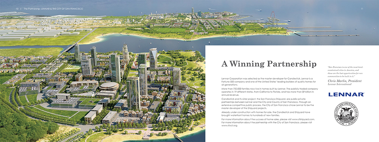
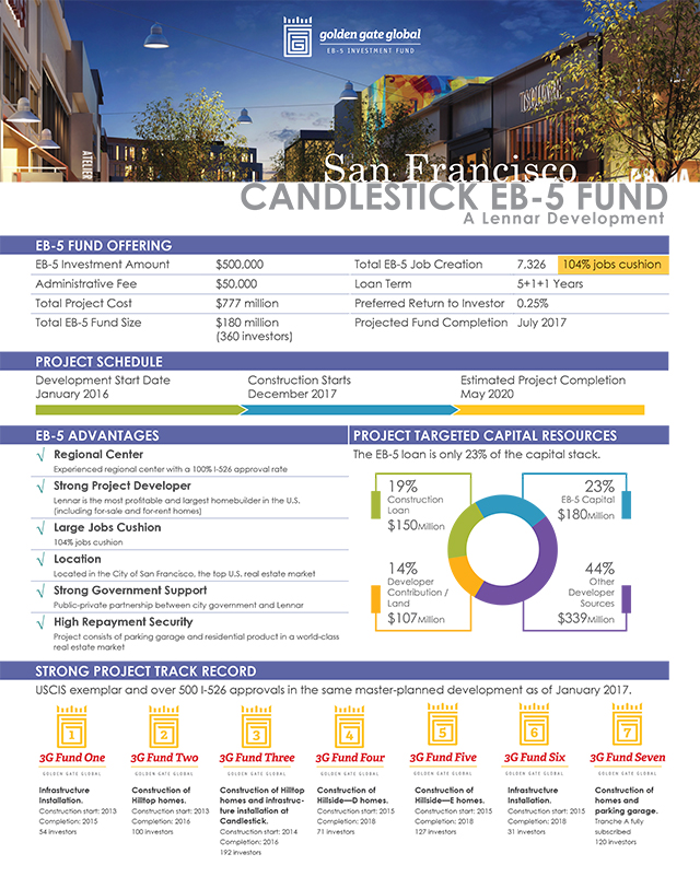
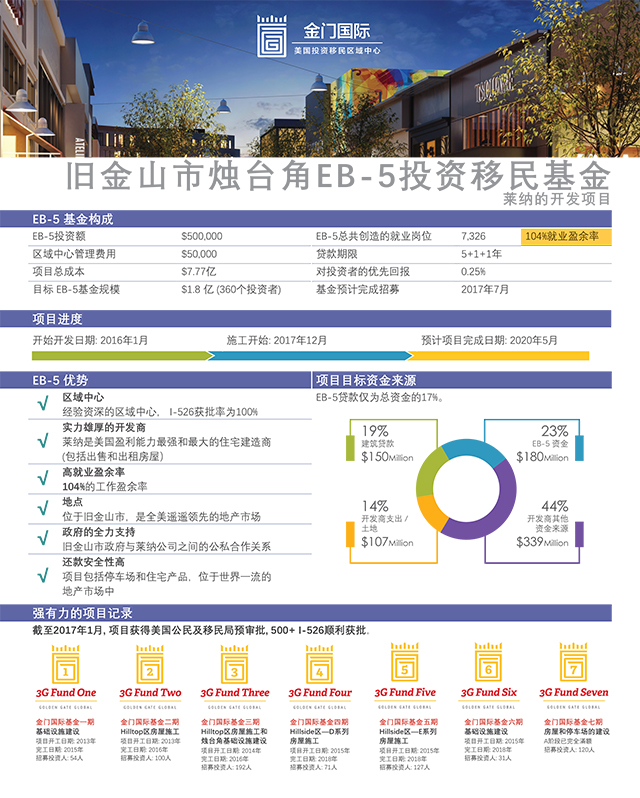
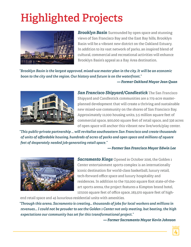
Golden Gate Global approached me to design a brochure to showcase their Candlestick EB-5 fund for a real estate development at Candlestick Point. They wanted a clean and professional design and provided 3-D renderings of the project. They also stipulated that the brochure would be translated into other languages, Chinese in particular, and my design would need to accommodate for that. The 16-page brochure was designed in Adobe InDesign with charts created in Adobe Illustrator.
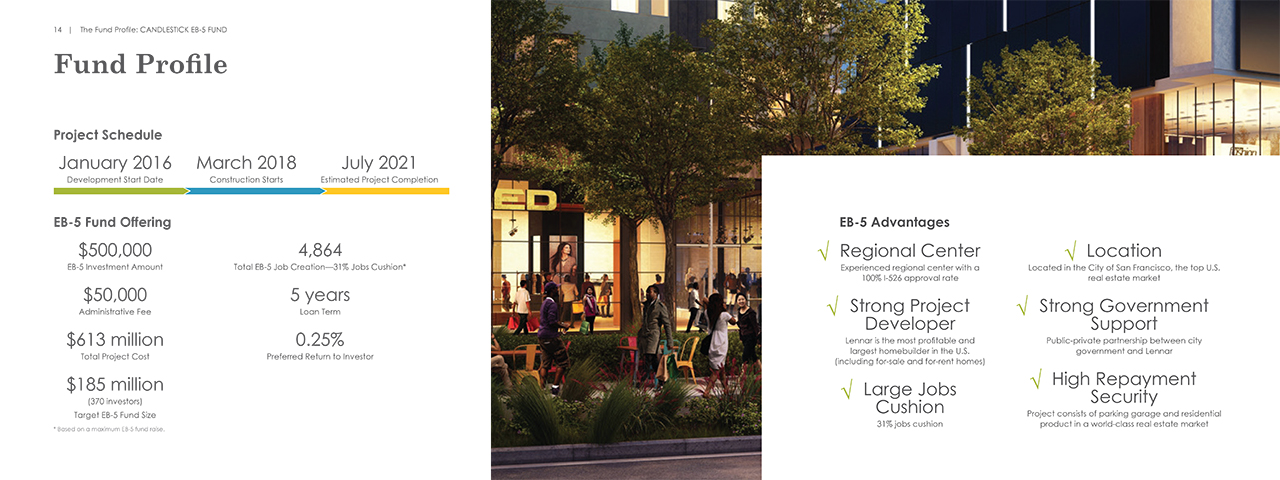
Candlestick EB-5 Fund Profile
ART DIRECTION, CONCEPT DESIGN, BRANDING
As a companion piece to the brochure, I designed the profile with the same 3-D rendering image in the header. I also used the same branding elements, color, font, and graphics, from the brochure. The profile could stand on its own as well as serving as a companion to the brochure. The profile was also translated into Chinese for prospective investors from China.
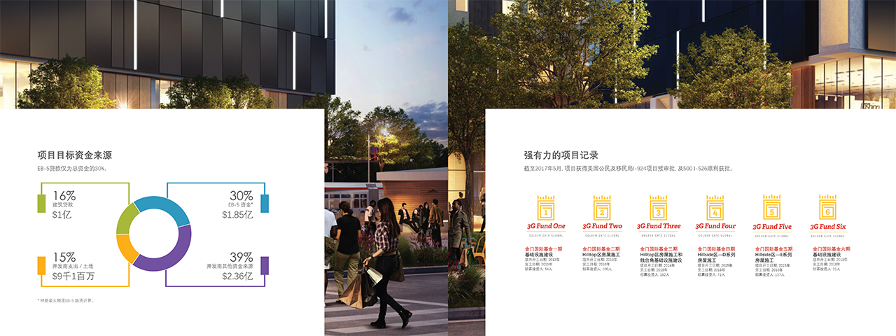
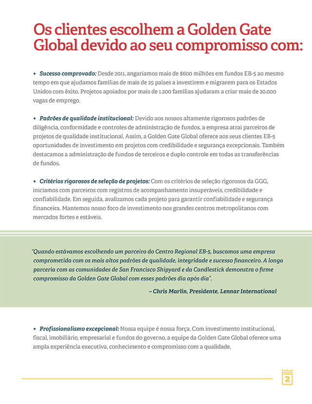
Marketing Collateral
DESIGN, BRANDING
I designed the Golden Gate Global Corporate Brochure and it was translated into multiple languages. The sample below includes English, Chinese, and Portuguese. The tricky part of accommodating different languages in a design is spacing. The same phrase in Chinese could be much shorter than one in English. Hence, the font size needs to be adjusted for legibility which could impact the rest of the design.
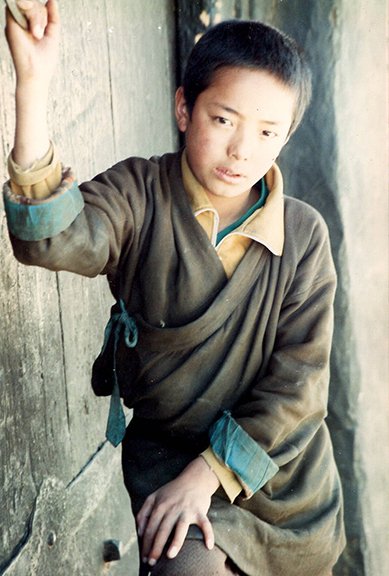
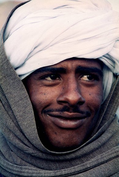
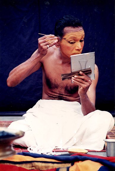
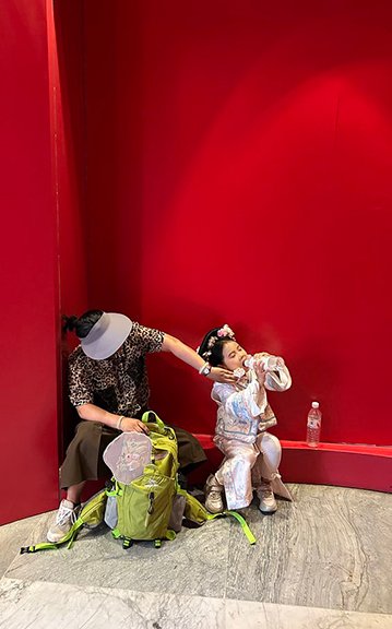
Photography
Photography is my way of exploring the world and the people who shape it. I’m inspired by diverse cultures, landscapes, and everyday moments that reveal our shared humanity and beauty.